UI/UX · Mobile app
Tomato
A food ordering app built around one question: what am I eating tonight?
- Role
- Product designer — research, UI, prototype
- Tools
- Figma
- Year
- 2025
Overview
Tomato is a self-initiated food ordering concept designed to practice the full UX process — from user flows to a high-fidelity prototype of the browse, customise and checkout journey.
The challenge
Food apps overwhelm people with menus before they have decided what they want. Ordering a single burger took too many taps, and combos were buried behind categories.
Approach
- 01
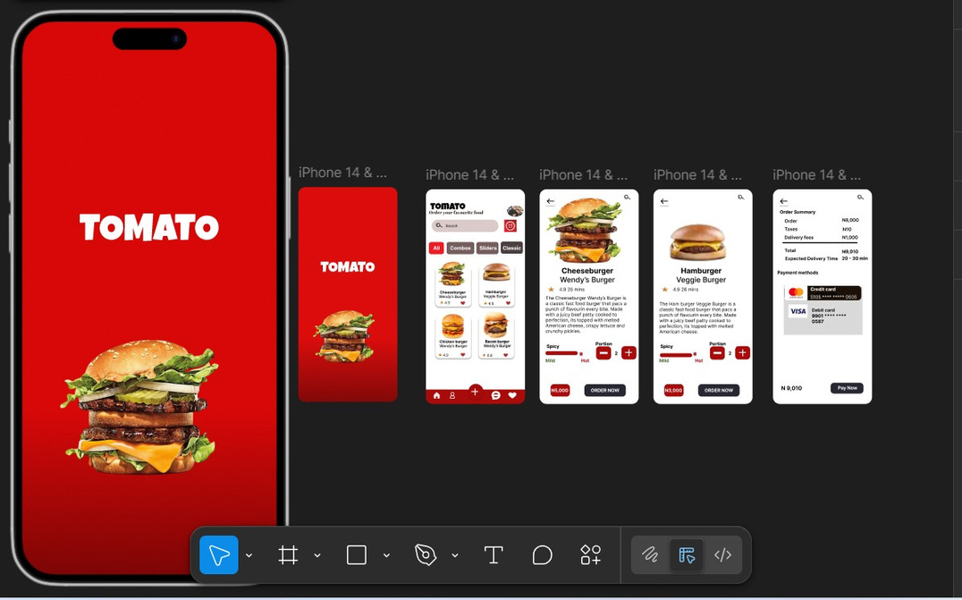
Mapped the ordering journey and cut it to three screens: browse, item detail, order.
- 02
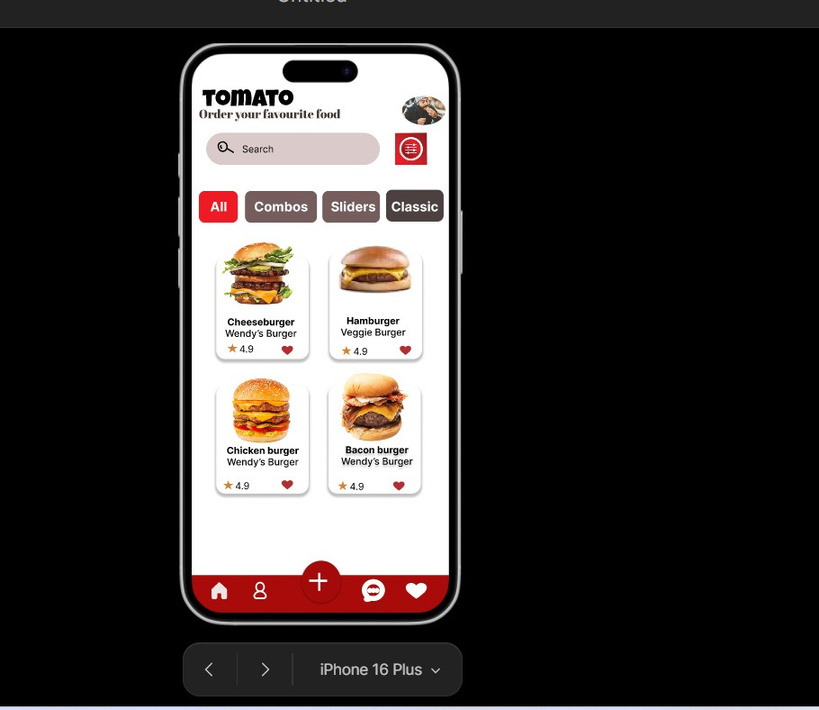
Grouped the menu into Combos, Sliders and Classic so choice feels smaller, not bigger.
- 03
Designed a detail screen that carries portion, spice level and price in one glance.
- 04
Prototyped the flow in Figma and refined tap targets and hierarchy after walkthroughs.
Screens

Outcome
A clean, appetite-led interface where a first-time user can place an order in under a minute — and a full case exercise in UX thinking, not just visuals.
Keep reading