PRODUCT DESIGN CASE STUDY
DATE Circle
Designing a dating experience around trust and safety.
- Project
- DATE Circle — Designing a dating experience around trust and safety
- Platform
- iOS · Mobile
- My Role
- Lead UX Designer
- Program
- DYEN, Product Design Cert.
- Deliverables
- Empathy mapping, Persona, Journey mapping, Low/Mid-fidelity wireframes, UI screens, Live Web App
- Timeline
- 2026
- Live App
- Live on Vercel
Mismatched Intentions
Mismatched intentions: genuine daters get lost among hookup-seekers, with no way to filter or feel safe.
Trust-First Architecture
Design for trust upfront: vet intent during onboarding, make discernment effortless on discovery cards, and replace awkward chat stalling with a structured date planner.
Real Connections
Signal intent early, protect trust throughout, and make ‘let’s actually meet’ a real feature — not an afterthought.
Project Overview
A mobile dating app concept built around a simple choice: people don't want to scroll and swipe meaninglessly, they want matches that lead to something meaningful. This case study details the empathy research, journey mapping, low/mid-fi wireframes, and high-fidelity iOS screens engineered to design a dating experience around trust, intentionality, and safety.
-01- THE PROBLEM
Two problems worth solving
Talking to daters about their app experience kept surfacing the same frustration: matching with someone only to learn, several messages in, that you wanted very different things.
Mismatched Intentions
Signal intent early, protect trust throughout, and make ‘let’s actually meet’ a real feature — not an afterthought.
Safety & Recourse
Without a clear, accessible way to flag or report a match who crosses a line, users have little recourse — which quietly erodes how safe the whole app feels to use.
-02- THE EMPATHY
Getting inside the user’s head
Before any screen was drawn, I created an empathy map pulling together what daters actually say, think, do, and feel when they’re deciding whether the app — and a match — is worth their trust.
“I don't want more matches. I need matches that actually mean something.” / “Let's actually meet up instead of texting for weeks.”
“Are they genuinely looking for a relationship or just looking for casual hookups?” / “Is this person who they say they are?”
Checks profile details and career info before swiping, responds cautiously, drops conversation when intentions don't align.
Guarded when browsing, skeptical about promises, exhausted by endless superficial swiping, hopeful for genuine connection.
Project Goals
Signal Intent Early: Surface relationship goals directly on discover cards to filter hookup ambiguity before swiping.
Protect Trust & Safety: Provide accessible, one-tap reporting and blocking so daters always feel safe and empowered.
Make Meeting a Feature: Replace awkward chat stalling with a structured in-app date planning invite and curated venue presets.
Eliminate Swipe Fatigue: Focus on curated, intentional matches rather than infinite superficial scrolling.
-03 USER PERSONA
The empathy map's says, thinks, does, and feels came together in one person — a composite of the dater's problem
Meet Sophia

Sophia Ovo
Sophia Ovo has been on and off dating apps for 2 years. She’s outgoing, career-focused, and genuinely wants a long-term relationship — but she is getting tired of profiles that look promising only to reveal the person only wanted a hookup.
Goals & Priorities
- To find someone with same intentions
- More time getting to know good ones.
- Feel safe to take conversations to real date.
Frustrations
- No easy way to flag or block someone who crosses a line
- Bios that look promising, don't always hold up in chat
- Feel safe to take conversations to real date.
“I don't want more matches. I need matches that actually mean something.”
-02- THE EMPATHY
From interest to actually meeting up
Mapping the journey end to end showed exactly where trust is won or lost — mood dips hardest right after matching, when a conversation can reveal a mismatch. That’s the moment the product was designed for.
Discovers the app
Curious but skeptical: 'is this different from every other app?'
Onboarding
Reassured by the vetting & matching promise before signing up.
Sign up & verify
Quick friction — a phone number and a 4-digit code.
Chat after a match
The trust risk point — where mismatched intent usually surfaces.
Plans a date
A structured invite replaces the awkward 'so... when?'
Meets up
The actual goal of the app, reached with less guesswork.
Wireframes & Structural Architecture
Before applying visual styling, screens were explored and validated in low-fidelity and mid-fidelity wireframes to establish clear visual hierarchy, tap accessibility, and effortless user progression.
Sketching the skeleton first
Before any colour or photography, wireframes locked down hierarchy and flow for moments that mattered most: setting expectations, discovering matches, celebrating a match, and planning a real date.
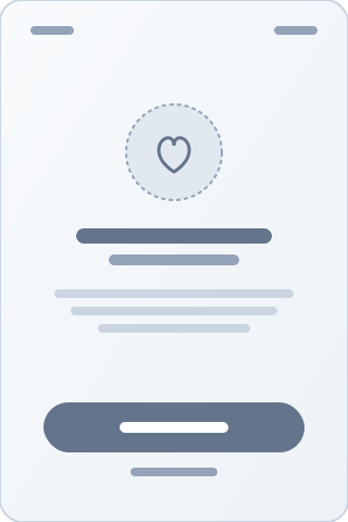
ONBOARDING
Value framing & intent vetting
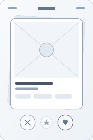
DISCOVER
Card layout & bio cues
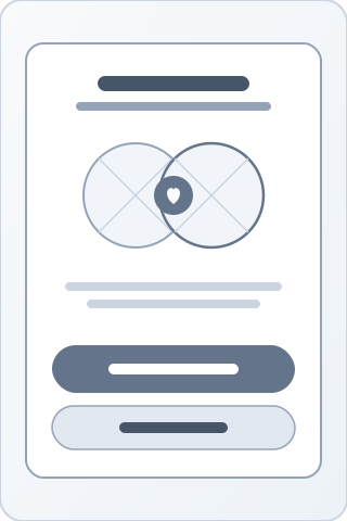
MATCH
Immediate action modal
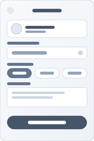
PLAN A DATE
Structured invite & presets
Adding structure and real copy
Once the skeleton held up, wireframes were rebuilt with real content, spacing, and componentry — still colourless, so feedback stayed focused on hierarchy and wording rather than visual polish.
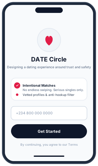
Onboarding
Value prop & phone verification
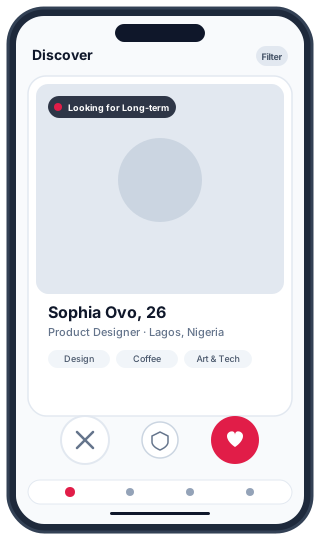
Discover Card
Intent pills & safe interaction
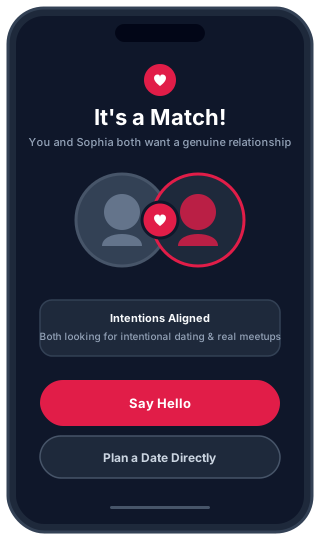
Mutual Match
Momentum & dual callouts
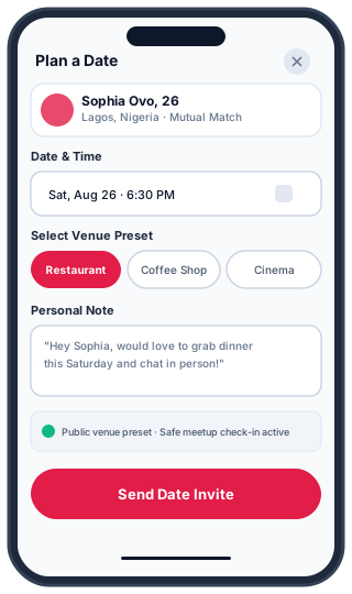
Plan a Date
Venue presets & date details
High Fidelity UI Breakdown
High-fidelity screens designed with Coral (#E53950) accents, soft Cream canvas tones, and Marigold (#FBC02D) highlights for trust, warmth, and engagement:
01 · Brand Identity
Signature Splash & Welcome
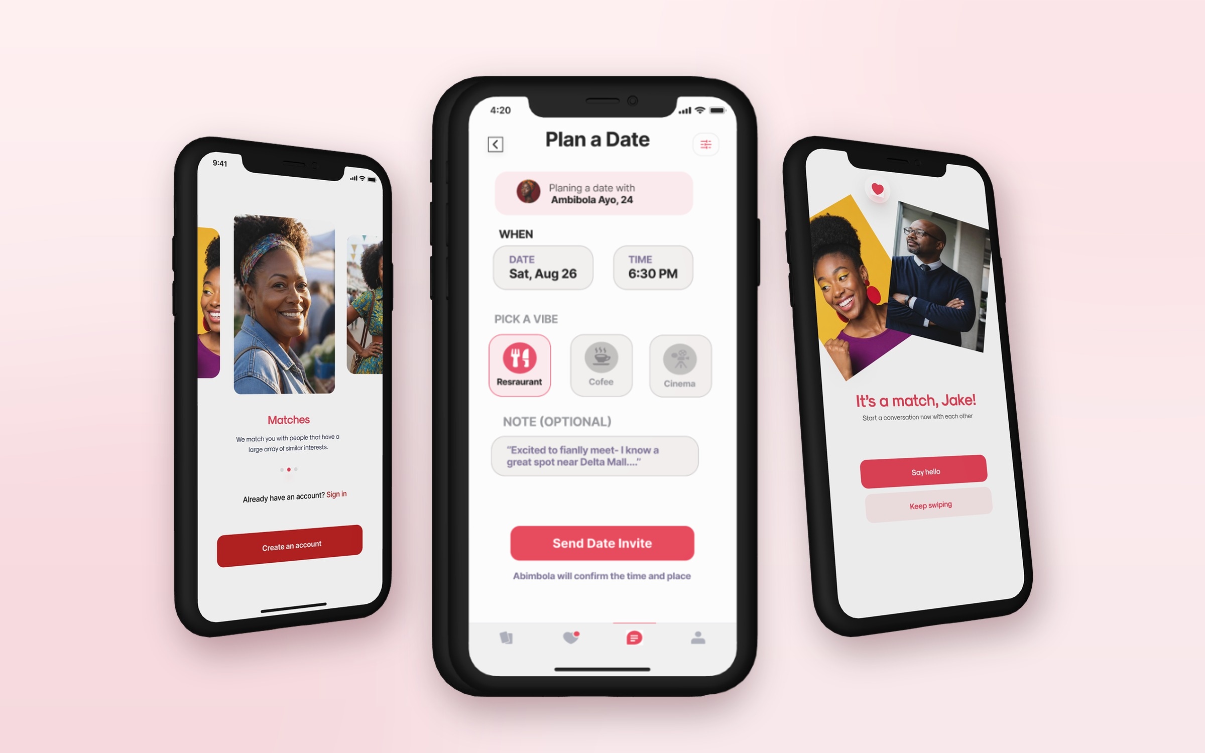
Clean, minimalist splash interface introducing the DATE Circle brand with the authentic interwoven ribbon heart logo and clean typography, establishing an authentic, romantic tone from the first launch.
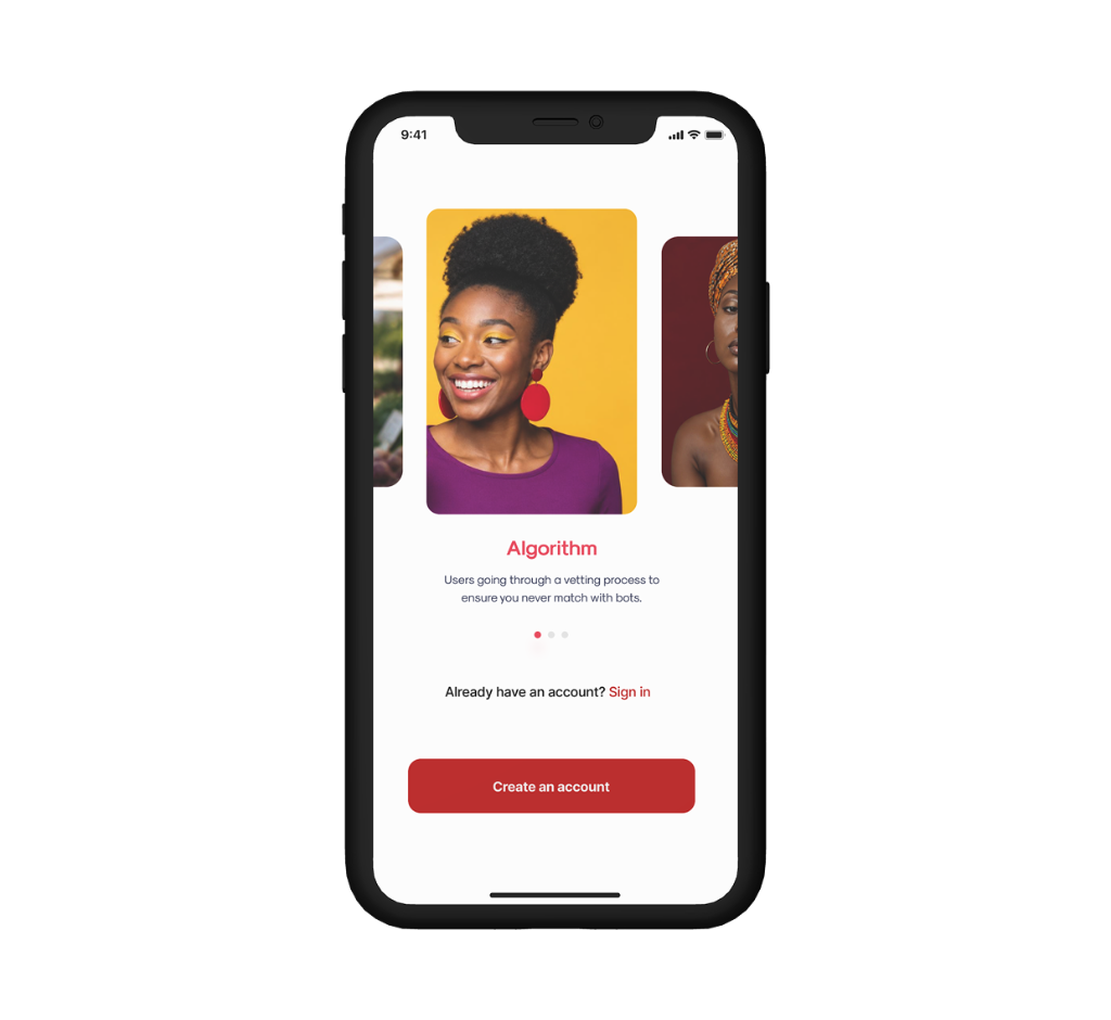
02 · Trust & Safety
Smart Vetting Algorithm
An intuitive onboarding step educating users on DATE Circle's vetting mechanism that verifies real singles and safeguards the community against bots, bad actors, and ghost accounts.
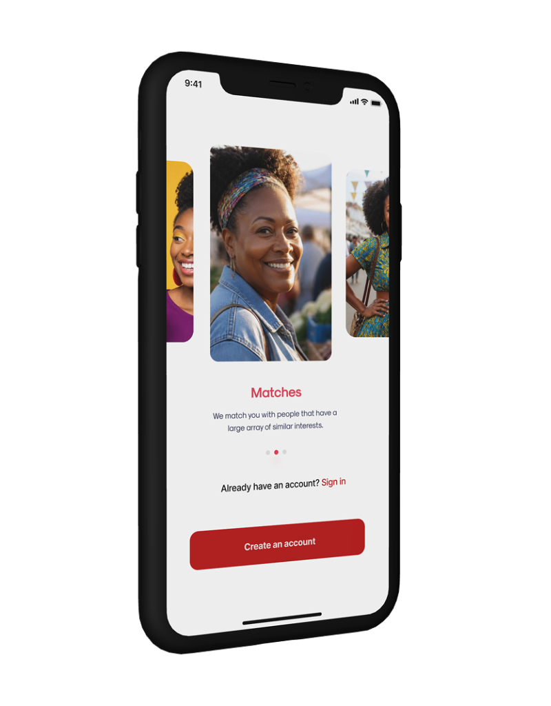
03 · Curated Connections
Interest & Intent-Based Matching
DATE Circle matches singles who share aligned relationship intentions and genuine lifestyle goals, moving users beyond superficial swipes toward real, mutual chemistry.
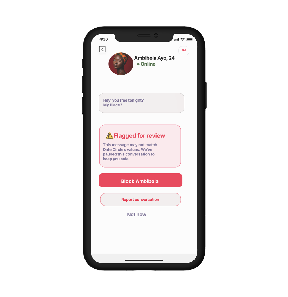
Flagged for Review
Automatic content & boundary pause
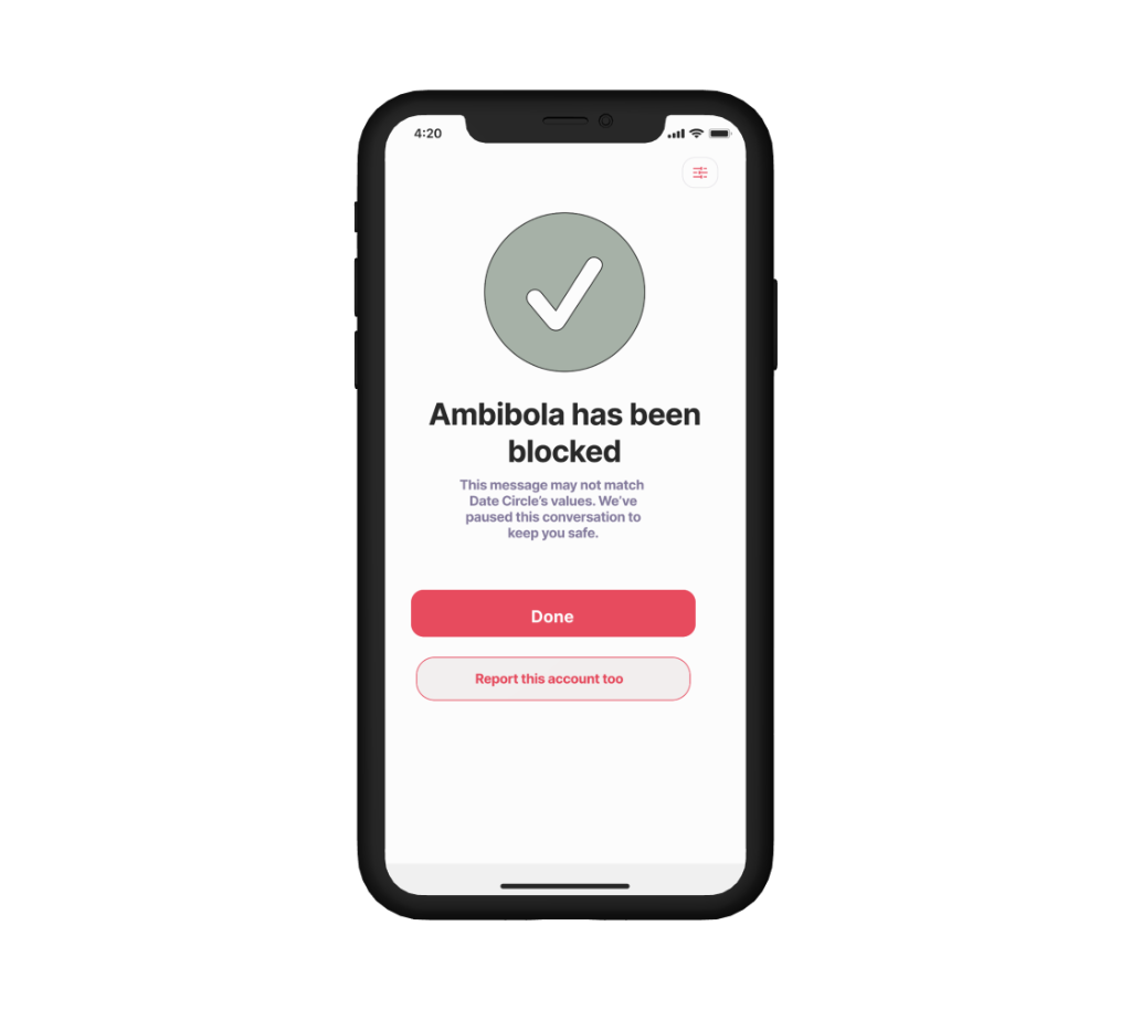
Instant Recourse
Immediate block & reporting confirmation
04 · In-App Safety & Protection
Flagged Content & Instant Block Controls
Directly tackling Problem 02: If incoming messages breach community values (e.g. unsolicited hookup demands), conversations are proactively paused with a clear warning, giving users immediate, low-friction controls to block or report the account.
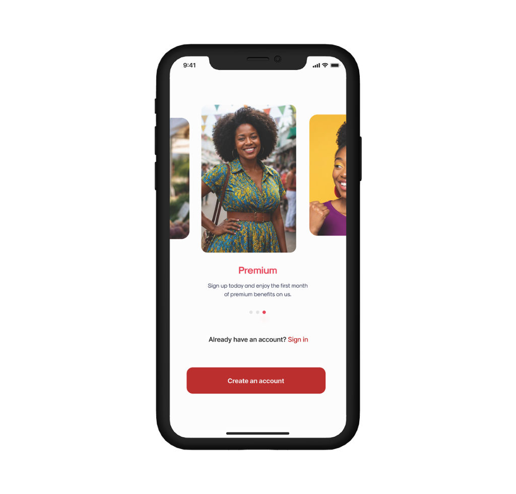
05 · Premium Experience
Complimentary Premium Benefits
Welcoming new daters with a complimentary first month of premium benefits, providing enhanced profile visibility, unlimited swipes, and curated date recommendations.
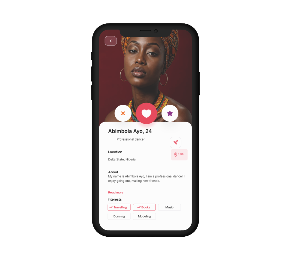
06 · Discernment & Lifestyle
In-Depth Profile & Intent Context
Rich profile presentation with verified photography, dancer career context, intentional tags (Travelling, Books, Music, Dancing, Modeling), and accessible one-tap reporting to safeguard every interaction.
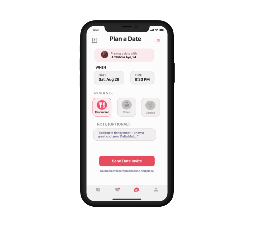
07 · Centerpiece Feature
In-App 'Plan a Date' Invite Flow
Rather than letting conversations stall in dead-end messaging threads, DATE Circle empowers daters with a structured date planner. Users can schedule a date with their match (e.g. Sophia Ovo, 26), set the date & time (Sat, Aug 26 at 6:30 PM), pick a curated vibe preset (Restaurant, Coffee, Cinema), include a personal note, and send an invite with one tap.
Colour & TYPOGRAPHY
The system behind the screens
A deliberate palette chosen for emotional warmth, safety, and clear visual hierarchy:
Cream
#FFF5EB
Warm base foundation & calm canvas
Coral
#E53950
Primary brand accent, passion & affirmative action
Marigold
#FBC02D
Highlights, verification badges & trust cues
Interactive Recruiter Demo & Live Build
To showcase how this design transitions into a real, functional product, I built and deployed an interactive web application on Vercel. Recruiters, hiring teams, and prospective users can interact with the live flow, test ergonomics, and experience the UI responsiveness on mobile and desktop browsers.
Onboarding & Vetting
Experience the animated splash introduction, vetting algorithm education, and 4-digit SMS OTP verification flow.
Discover & Match Momentum
Browse discover swipe cards enriched with biographical discernment cues, followed by high-energy mutual match celebrations.
Dates Hub & Venue Presets
Explore the primary Dates navigation tab engineered with 1-tap venue presets for Restaurants, Coffee Shops, and Cinemas.
Reflection & Next Steps
Designing DATE Circle emphasized that the biggest hurdle in modern dating isn't finding matches — it's moving from match to meetup safely and with shared intent. By signaling intent early, providing in-app safety recourse, and introducing structured date invites, DATE Circle solves post-match fatigue at its root.
What I'd explore next
Outcome & Prototype
A complete, high-fidelity iOS mobile app design and fully functional live web application deployed on Vercel (https://http-localhost-3000-datecircle.vercel.app/) that removes post-match friction, transforming online dating from passive swiping into real, intentional meetups.